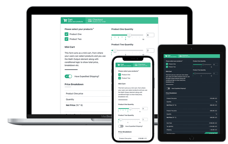
Container based responsive design with Dark Mode


Container Responsive Query
All grids and columns respond to the size of their container, not the document.

Automatic Dark Mode
Forms turn dark if that's your user's preference, if not stays light.

20+ Color Schemes
Choose from 20+ preset color schemes or roll your own.
Truly responsive design
WPEForm forms are truly responsive. They respect the size of the container you put them in. This is very helpful when you place the forms in narrow widgets or footers or popups. They just look good and work.
An example to attention to detail would be our Dropdown Element. It is available from FREE plan and very unique. When viewed from mobile it shows a pop-up type dropdown near the thumb of your user. When viewed from desktop, it shows a regular dropdown.
Another example would be the grid system upon which forms are built. The grids
can have any predefined width or any custom width based on custom queries. But
the grids do not respond to the overall width of the browser. Rather it responds
to the width of the container you put them in. So if you have, say a 50-50
columns in the form grid and you put the form in a small Widget of your website,
the grids won't try to split. Rather they will show up below, just like they
would on a small screen. This is possible because of new ResizeObserver API
modern browsers provide.
WPEForm is filled with modern and best practices. This gives you the best possible experience, without compromising speed.
You also get many form themes which would work with any WordPress theme out there. If you do not like our color schemes, you can always make your own.